Unifying the experience
360training was a house of brands, running courses through several separate branded websites including OshaCampus, Learn2Serve and Meditec. The brands had no relation, all had different user experiences, and were built at different times so had different code bases. Management and development was a real headache, and the separated approach created little brand equity for the parent brand.
Yet all sites essentially needed to do the same thing, with minor variations. With the technical platform being brought together to enable more efficient management of the courses and customers, it was time to do the same with the brands and UX.
We needed to clean up the brand architecture and then create baseline user experience that could easily be tweaked for the specific needs of a sector when needed.
Creating a coherent brand structure
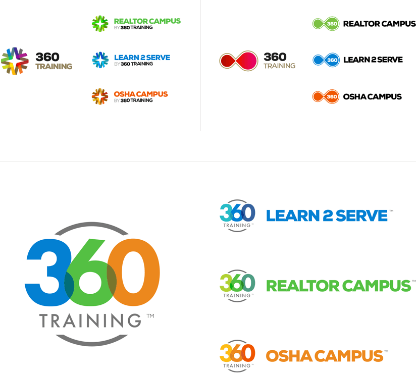
It wasn’t quite so simple as folding in all brands to the parent brand. Over the years, the sites had built significant equity within their respective sectors, so the names needed to be maintained (branded search volume was significant). But we also wanted to find a way to create wider recognition and add value to the 360training parent brand.
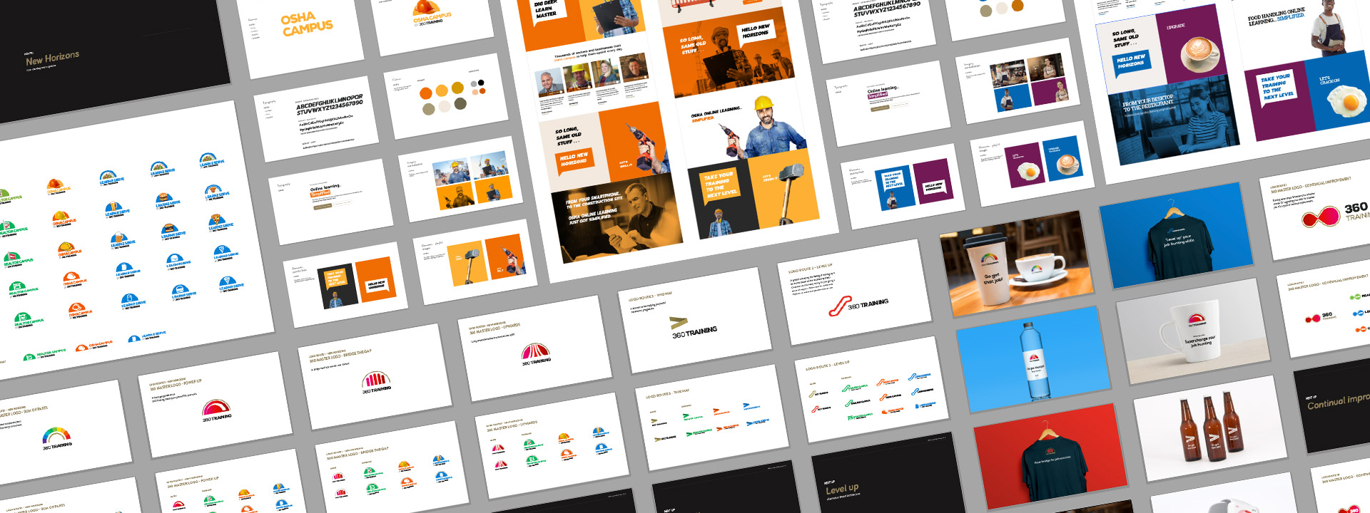
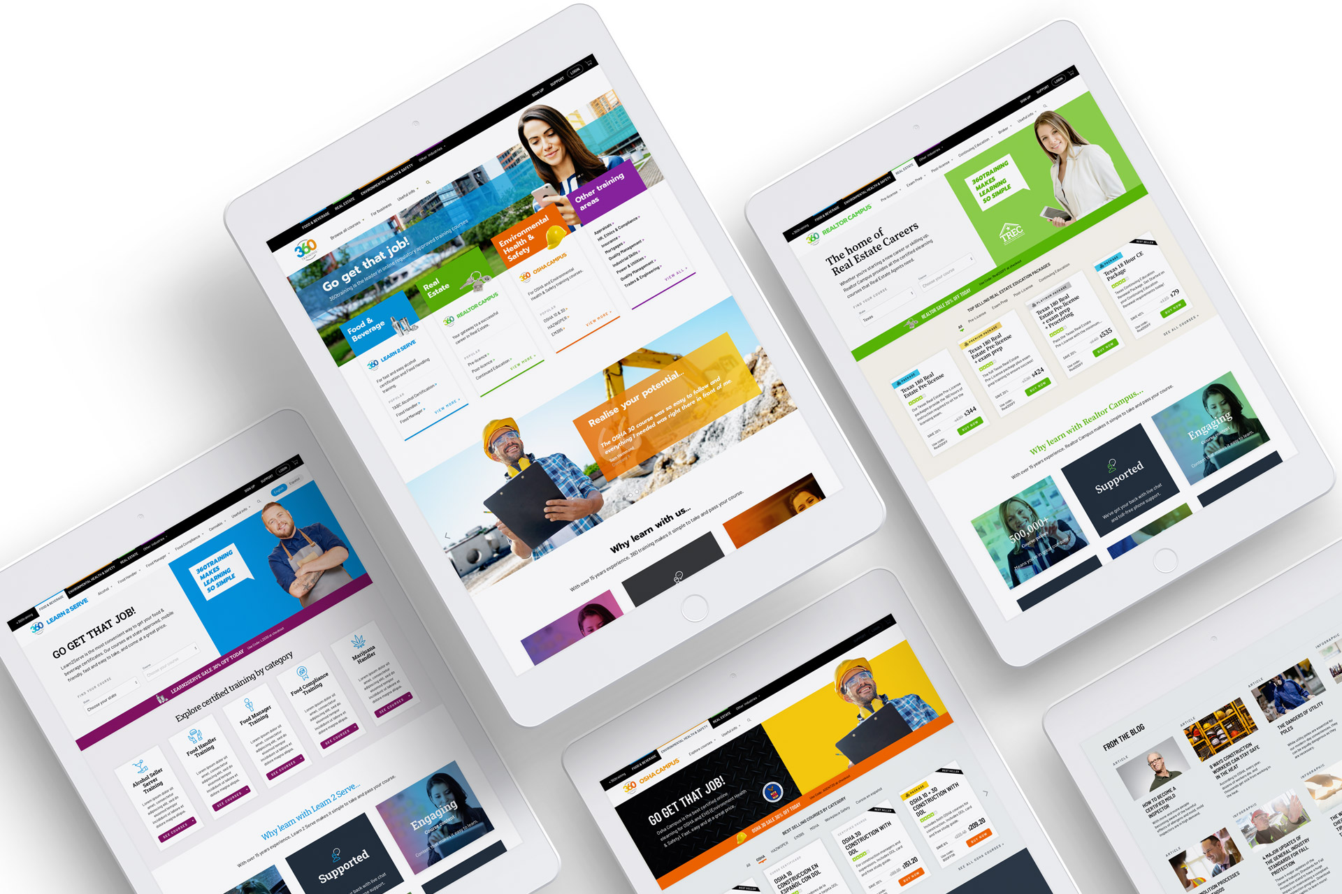
The approach was to update the visual identity to create a common mark that could be adapted for each sector. Each sector was differentiated by the wordmark, maintaining continuity to its old site through colour. The chosen route bakes the 360 training endorsement into the mark.
A brand new digital language
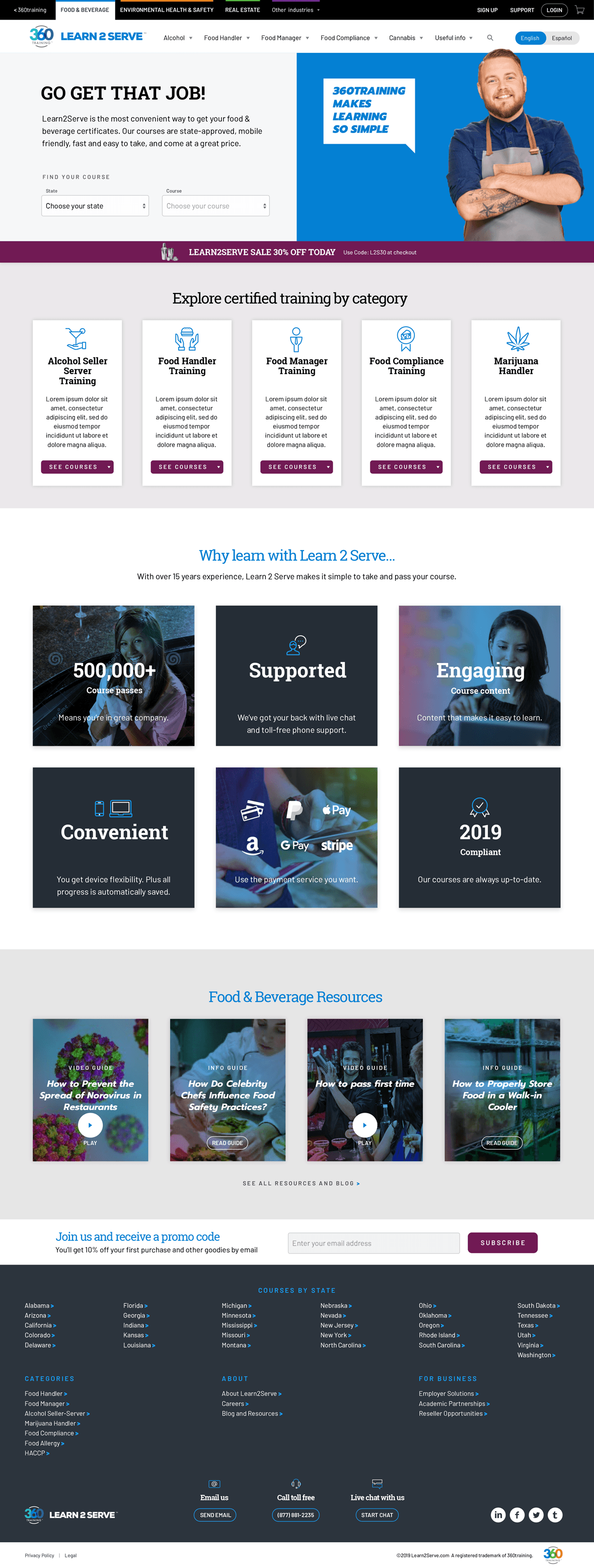
The digital experience was refined through iterated prototypes, built through XD and InVision. All the sector brands were brought within the overall 360training site, but retained their own identity. Common elements were then adapted to the needs of each sector.
Pages were evaluated and tested through Optimizely and UserTesting.com before further refinement prior to roll-out.
Turbocharging conversion
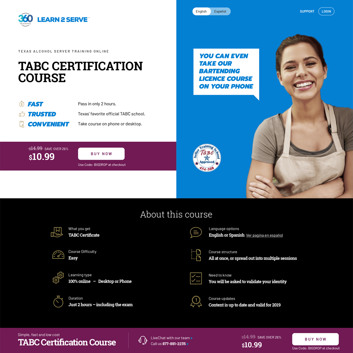
As with any ebusiness, conversion is a major metric. We redesigned landing pages and the checkout flow to optimise the conversion process. Conversion uplift for the course landing pages gave an almost instant Return on Investment (of course, we’re not allowed to say exactly how much).

Streamlining the checkout
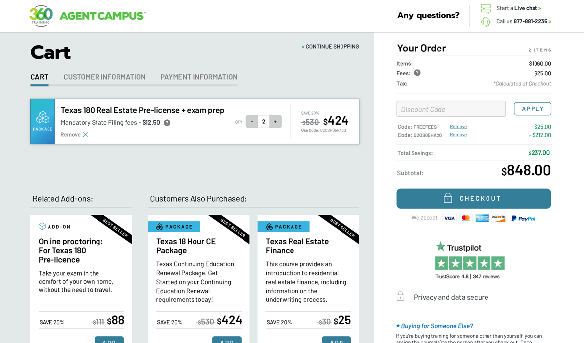
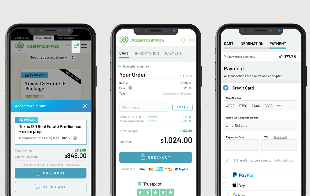
We redesigned the cart flow, refining the experience and user testing options to create a frictionless process. The new cart removes blockers, simplifies the process, is fully mobile commerce optimised, and has a more confidence-inspiring design.
Working with a global team
A project of this scale and complexity has a large amount of stakeholders across many business units and a team based around the globe in US, UK, Ukraine, Pakistan and Poland.
Fortunately we’re well set up for running projects with widely distributed teams, having years of experience working remotely with global clients.
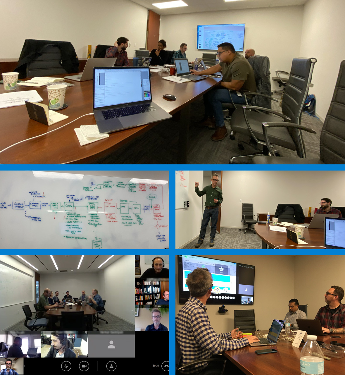
Our aim was to go deep quickly so we could deliver value fast. We spent time at HQ in Austin, workshopping with all key stakeholders to cover the business strategy, brand considerations, different legacy systems and nuanced requirements for each business unit. We ate a lot of breakfast burritos (recommended).
User research and testing was managed remotely, employing our user research toolbox.
Project development, testing and rollout is managed via regular virtual sessions. Zoom plays its part, supplemented by Asana, Mural, usertesting.com, Optimizely and Bitbucket.
