

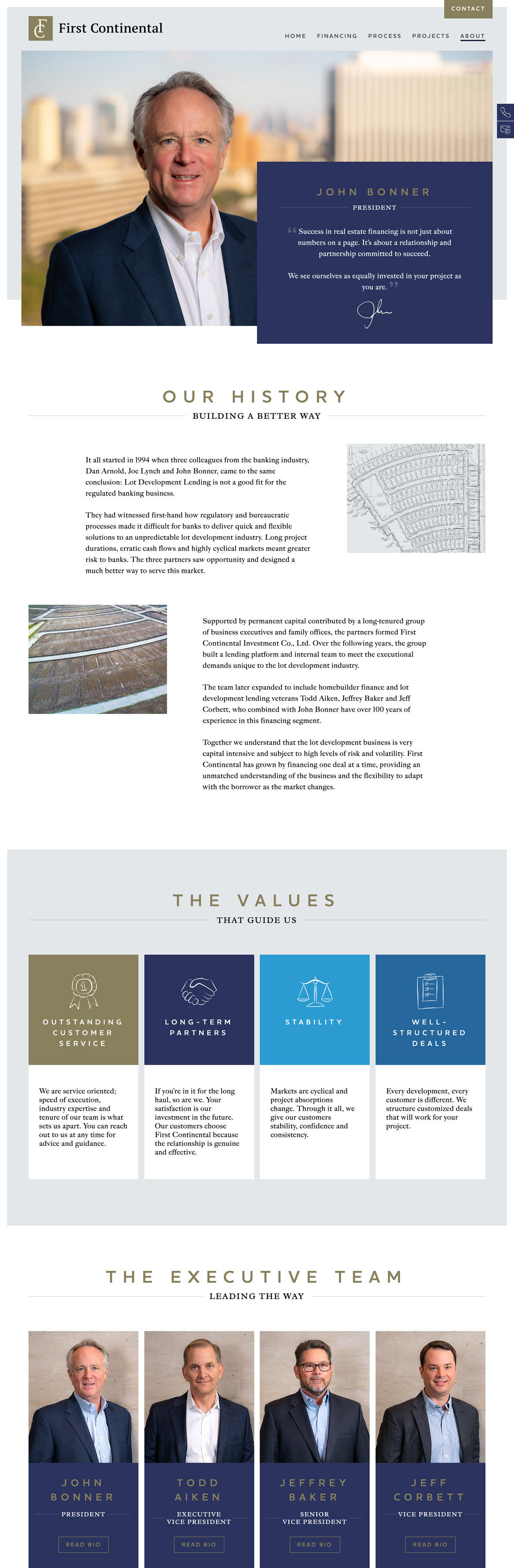
Defining the visual language
Our initial focus was on brand evolution. Aside from looking outdated, the previous brand palette (yellow and black) was too close to a certain German tyre manufacturer with a similar name.
The heritage and quality of the business demanded a more upmarket palette and font set.
To do this, rich blues were introduced as primary colours and the yellow evolved to gold and assigned as the accent colour. A contemporary serif font was paired with a capitalised display font to modernise the typography.
The logo was tidied and evolved, but still recognisable to any client familiar with previous versions.

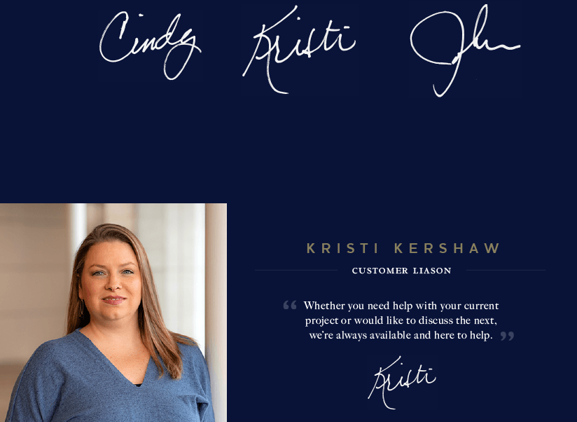
Creating the personal touch
First Continental is truly differentiated by its commitment to its people and the personalised service they provide to clients. Where many talk the talk about customer service but fail dismally in living up to it, these guys really deliver. It’s very refreshing for financial services. They understand the importance of CLTV.
We wanted to represent this in the design language, so across the site you’ll find imagery of their people, and signatures beneath to show real commitment. Small touches such as these communicate the truth behind the business.
Digital application
The site has a slim structure that focuses on telling the story clearly. Pages are built with a combination of brand elements to create a nice balance of image, graphic and typography. The hand drawn icons provide add a feel of quality which over-used stock icons can’t give.
The site is built on WordPress and fully editable.
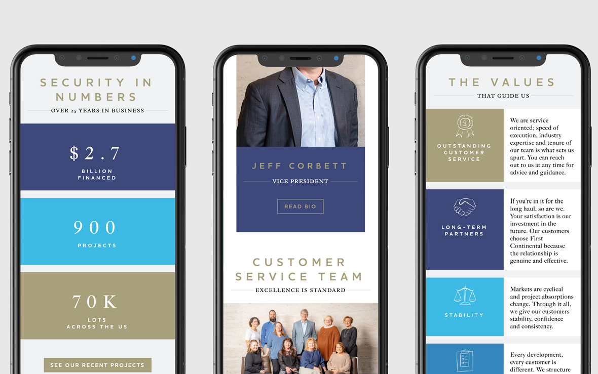
Mobile application
The mobile experience retains the same quality and feel, through carefully considered responsive design layouts.
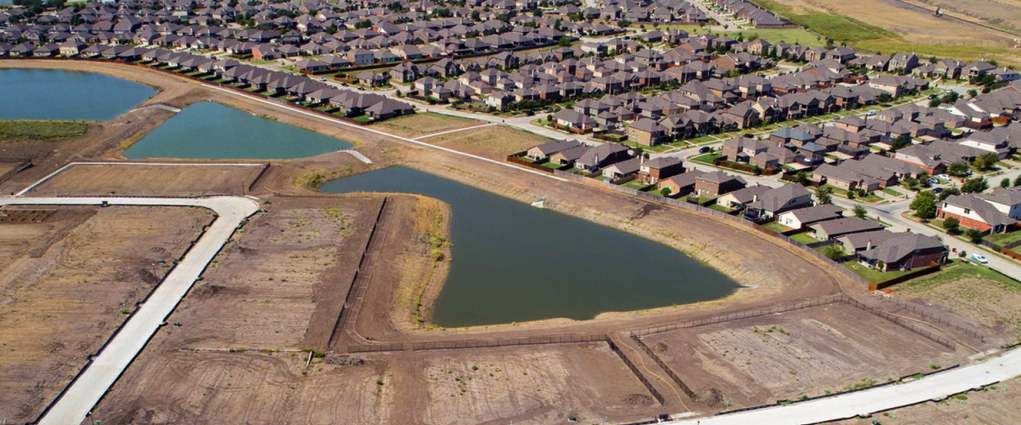
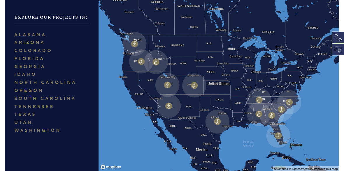
Interactive project mapping
The range of First Continental’s projects is presented through a custom Mapbox integration, enabling users to fluidly drill down to state and location to view project details.
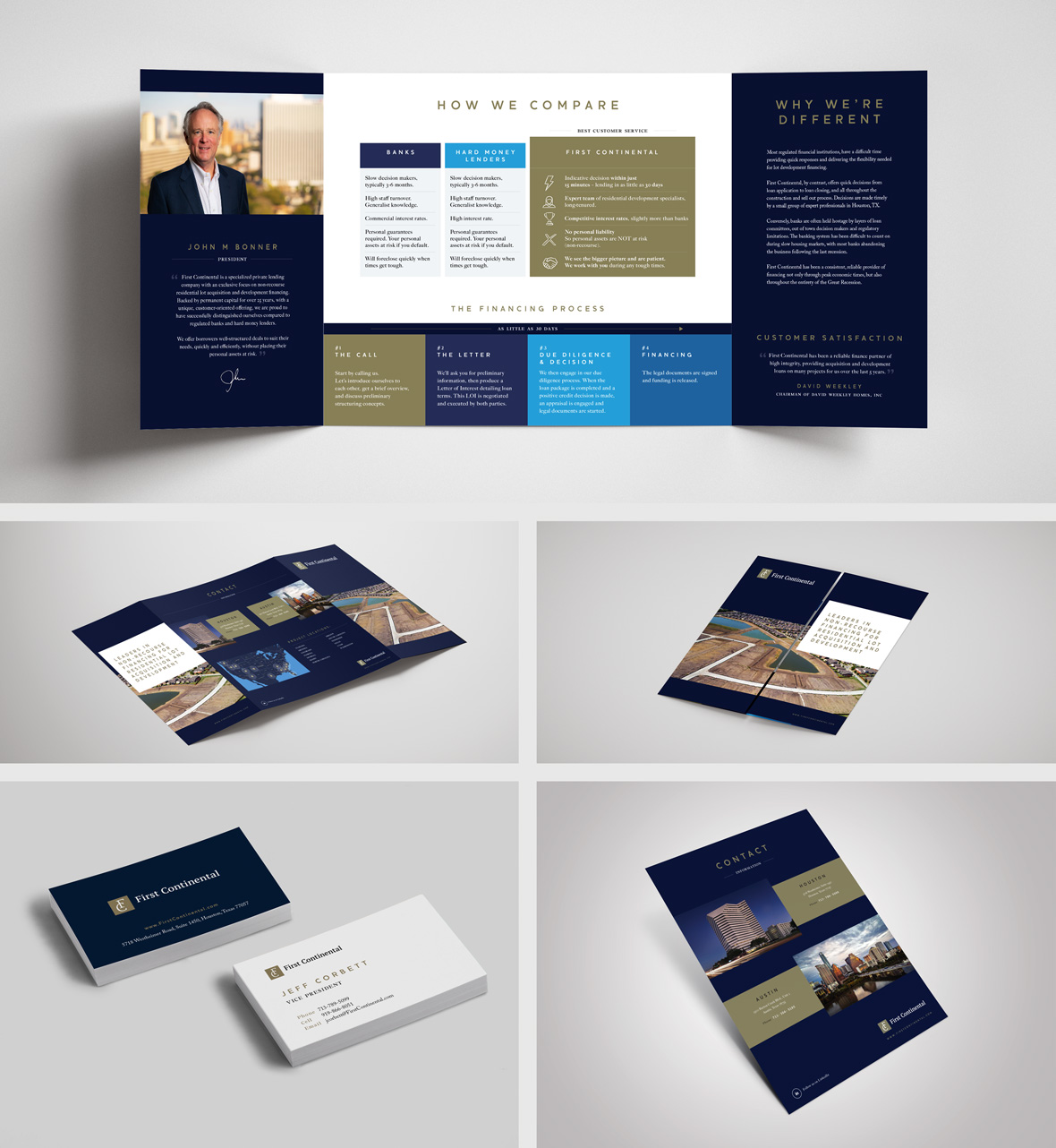
Bringing it to life in the real world
A range of collateral was designed for sales and event support, creating a coherent brand experience across non-digital and digital touchpoints.