AthenaHealth is a SAAS provider to the US healthcare market. They create great software that helps medical centres run more efficiently, allowing them to focus on their patients, not their admin.
We worked with partners MarketOne to design a new sales tool to support their channel partners in the sales process.
Turning complex into simple
This was a great UX and interface design project focused on making complex information and tasks simple. Whether the sales team were evaluating targets, or using the app within sales pitches, the experience was key. There were two main needs:
1. IMPROVE ADOPTION
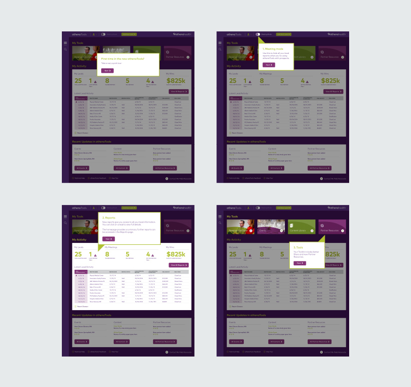
A previous tool had poor adoption rates. We had to design a tool that the sales guys actually wanted to use. It needed a high quality interface that gives easy access to all the tools and data while being simple enough for the sales team to dip in and out of.
Learning curve = minimal.
2. MAKE THE PLATFORM INVISIBLE
The tool was to be built upon the Salesforce Community Cloud platform. So we had to make sure the interface played well with that – but didn’t want to compromise the user experience in any way. The objective was to make the underlying platform invisible to the user.
Keeping it real
The key to success was a user-driven process, with input throughout from our real users – the sales team. We ran two rounds of remote user testing: first testing early conceptual prototypes to refine the design decisions, then later conducting task-based validation testing to check the functionality and usability of the UI.
The test participants were spread across the US. We held remote sessions in real life situations – for instance, with a time pressed Sales Rep sat in a car park waiting to meet a prospective client. This gave us great insight into how to make the interface work best for the team.
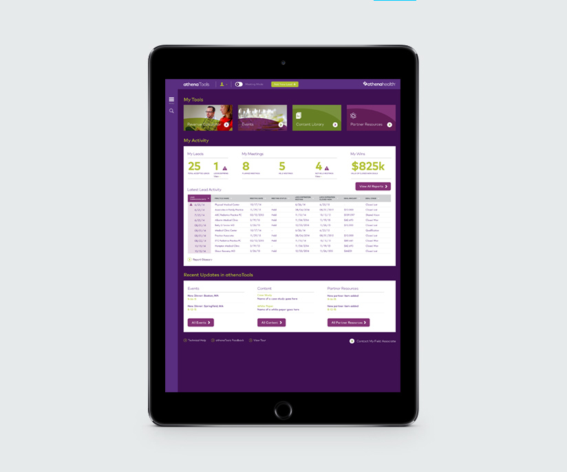
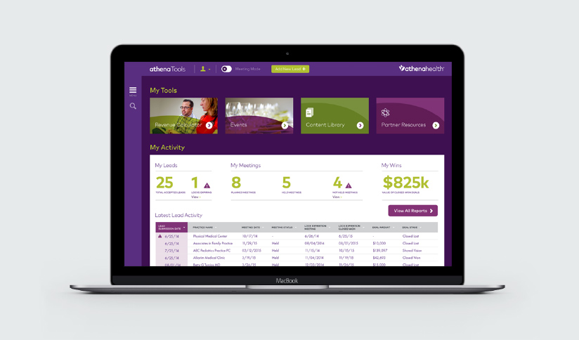
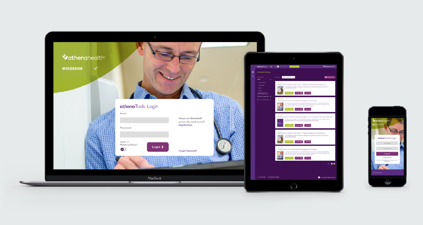
The sales team are partners so also use tools from other healthcare providers. We wanted our tool to be the best they’d experienced. After all, every interaction with the interface was an interaction with the athenaHealth brand – and a chance to create preference for the brand. That meant focusing on great design, thoughtful and helpful touches to the UI and compatibility across all devices.

Transformational adoption
The resulting interface is simple yet elegant and based exactly around the functionality the team need. It’s easy to use, containing some innovative functions that allows the information shown to be quickly changed depending on whether you’re using the client facing tools or doing your sales reporting.
After the design process, we then built out integration-ready front-end code for a seamless handover to the engineering team, who popped it into the SF communities platform.
Given the rigorous process we followed, plus the input from users throughout, the result was high adoption rates and a transformation of the sales lead management process.
"I have nothing but fantastic things to say about working with Hello you. I know this was a big project with a tight turnaround time and a demanding client. We threw a lot of curve balls at you and you were able to manage everything extremely well, and were always a great, trusted voice on our status calls with the client. Athena has very positive feedback as well, and overall this was a huge win for MarketOne and our relationship with the client. We couldn’t have done it without you!"