Getting closer to ‘the brotherhood’
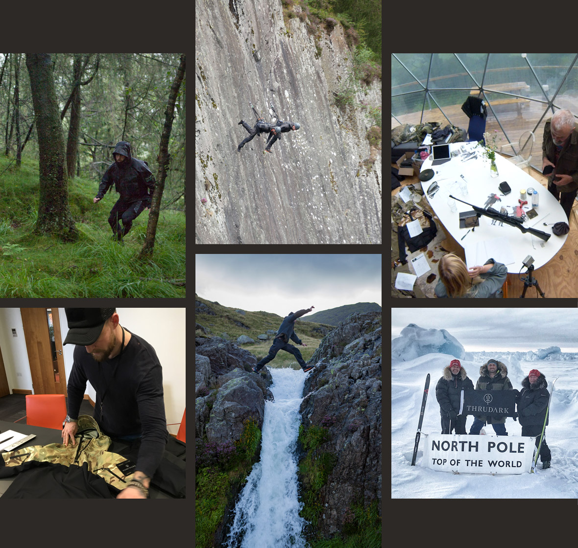
Partnering as design and technical agency for the launch of the brand, we really needed to get under the skin of the Special Forces mentality, as it’s shrouded in mystery. We spent time with the ex-special forces muscle behind the brand to really understand what makes them tick.
As a brand in its formative stages, we also were fortunate enough to working in parallel with the product development process, seeing first hand the exacting R&D process and requirements. This journey would go on to set the tone for the digital design language to come.

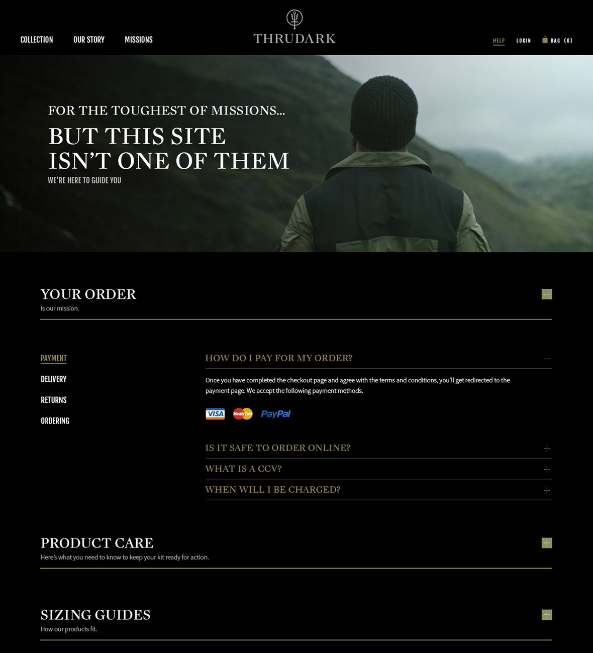
Design language – think black-on-black
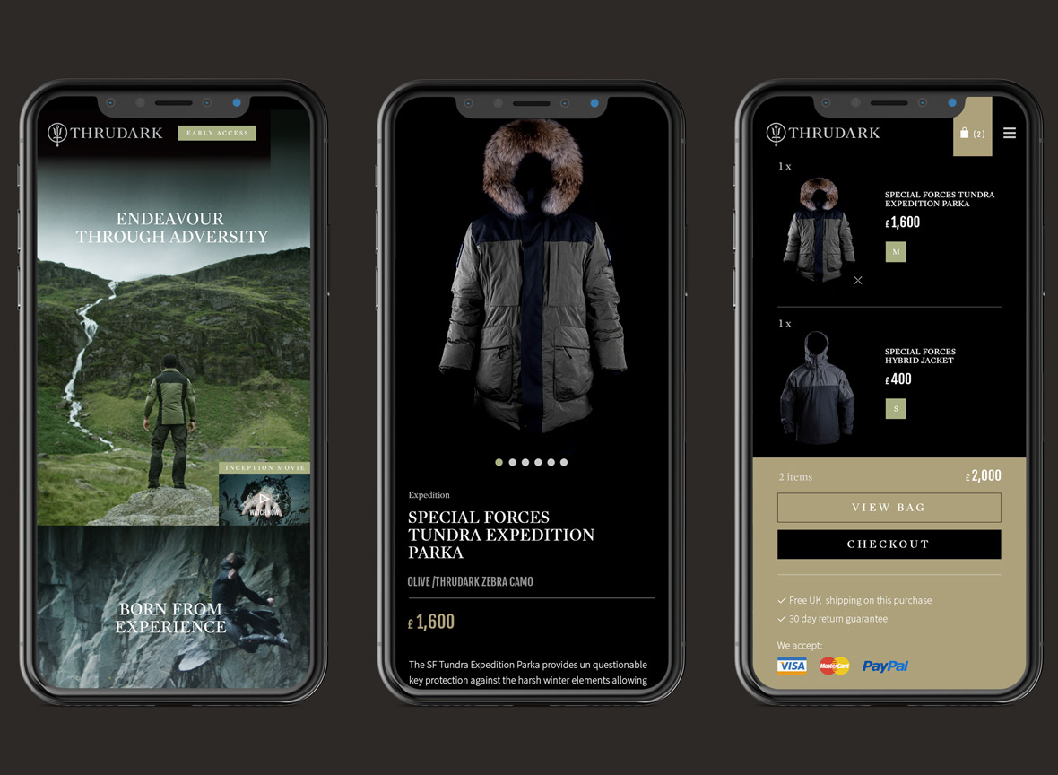
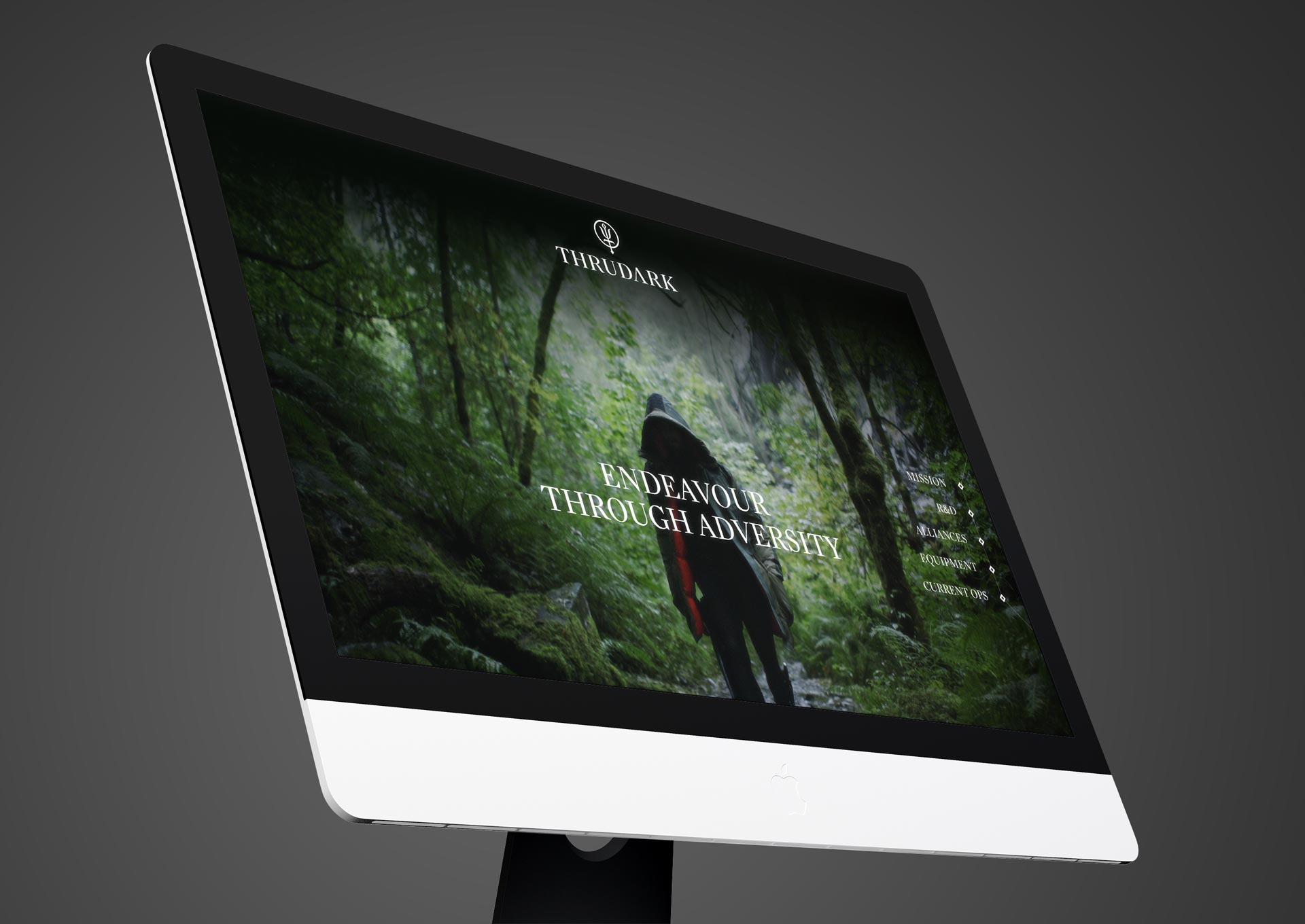
The digital design was built around Special Forces motifs and a sense of stealth, readiness and action – with a distinctly ‘under cover’ black-on-black aesthetic. The aim was to create clear differentiation between ThruDark and the rest by projecting he true essence of being a Special Forces operative.

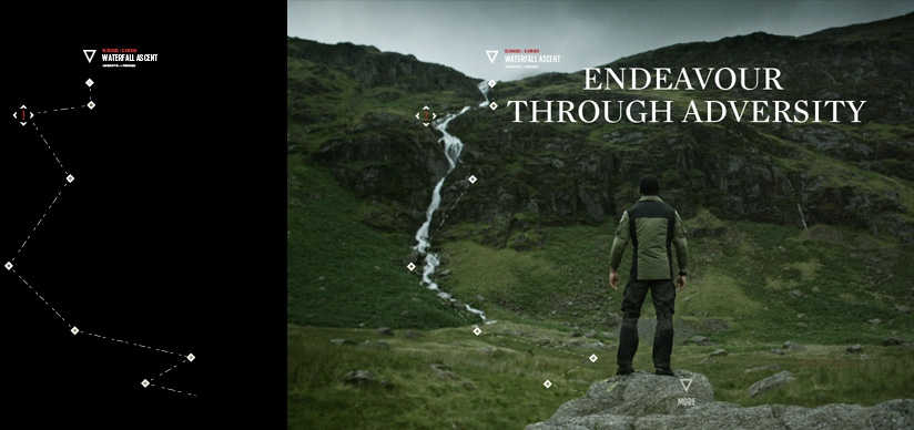
A teaser site kicked things off
Creating intrigue and anticipation alongside the social media build up campaign was critical in engaging the audience.
Then came the Ecommerce site
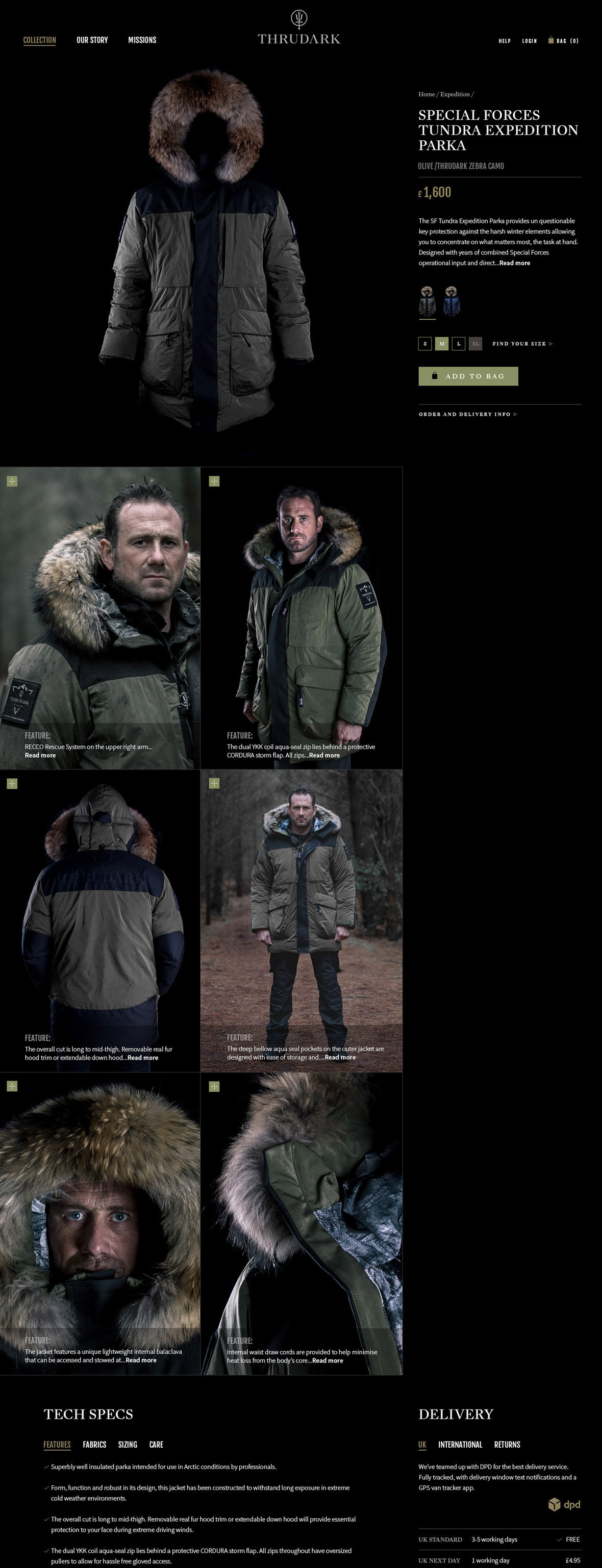
Stage 2 of the mission was adding full order taking and fulfilment into the site experience. We built the sales solution on WooCommerce with fully custom themes to support the brand credibility and ethos, whilst facilitating ease of sales management from the client end.

Mobilizing the operation
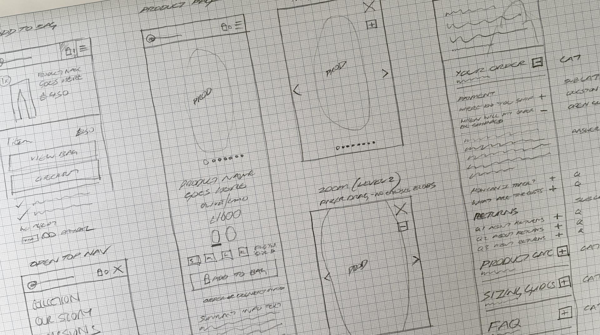
The brand is built for the wild outdoors, meaning its digital equivalent needed to operate flawlessly out in the field too.
