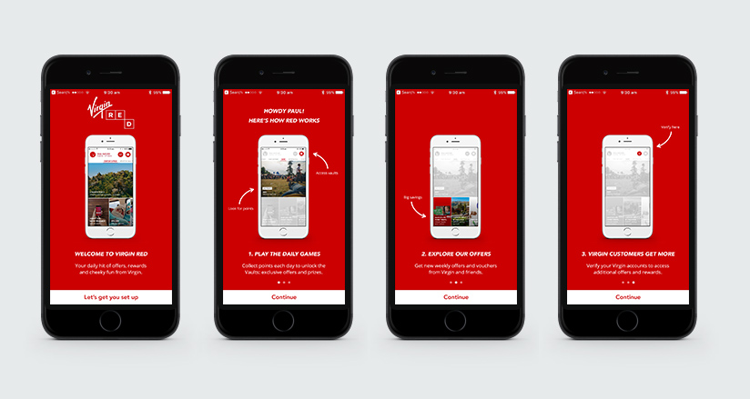
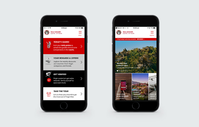
Virgin Red is Virgin’s loyalty and rewards programme for customers across all Virgin brands. The programme is centred around an app, which provides a funky game-orientated approach to loyalty that’s a breath of fresh air compared to your run-of-the-mill rewards schemes.
Famously ahead of the curve and renowned for Customer Service, Virgin knows that however good you are, there’s always room for improvement. We were commissioned to help find ways to enhance the user experience and boost engagement with the overall aim to increase the number and frequency of repeat visits.
To do this, we first ran a diagnostic phase to understand the problems and identify opportunities. We surveyed the large user base on their experiences and opinions, then ran a series of one-on-one user tests to observe real-life app use.
Insights gained enabled us to identify and prioritise a series of improvements: from tiny tweaks to remove annoyances and blockers, to the reworking of features, to labelling and UX enhancements that enabled users to form a faster mental model of how the app works. Insights gathered also helped inform wider strategic direction into the future of the rewards programme and the next iteration of the app, currently ongoing.
Project designs:


