

Evolving a leadership brand
TRIUM’s continual position at the top of the Global EMBA rankings is built upon the constant renewal of its curriculum to ensure it always provides its students with the most relevant, challenging and inspiring education possible in today’s fast changing world.
We believe the brand should likewise keep moving forward… without breaking from the past. So our first step was to evolve the brand language to create some clear space between TRIUM and its competitors, who have a tendency to blur into a templated sea of sameness.
This involved a subtle redesign of a number of elements – including fonts, colours, and graphics – that together add up to a more distinctive look that visually supports the program’s key pillars of geo-politics, socio-economics, technology, leadership and entrepreneurship, and reflects the ethos, academic firepower and experience of the program.

Website renewal, grounded in research
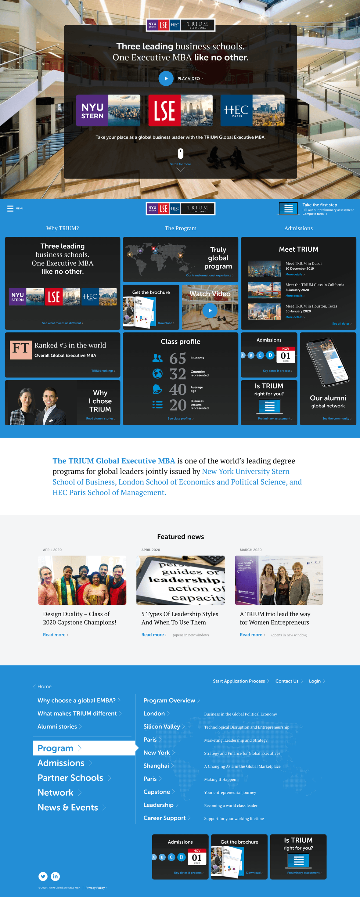
The previous website performed well, but we knew more could be done to help prospective candidates develop a clear preference for TRIUM. User research gave us clear priorities in what this should be.
Part of the insight from the research was about classic brand differentiation: we needed to be clearer about what makes TRIUM different to the rest. And part was showing it.
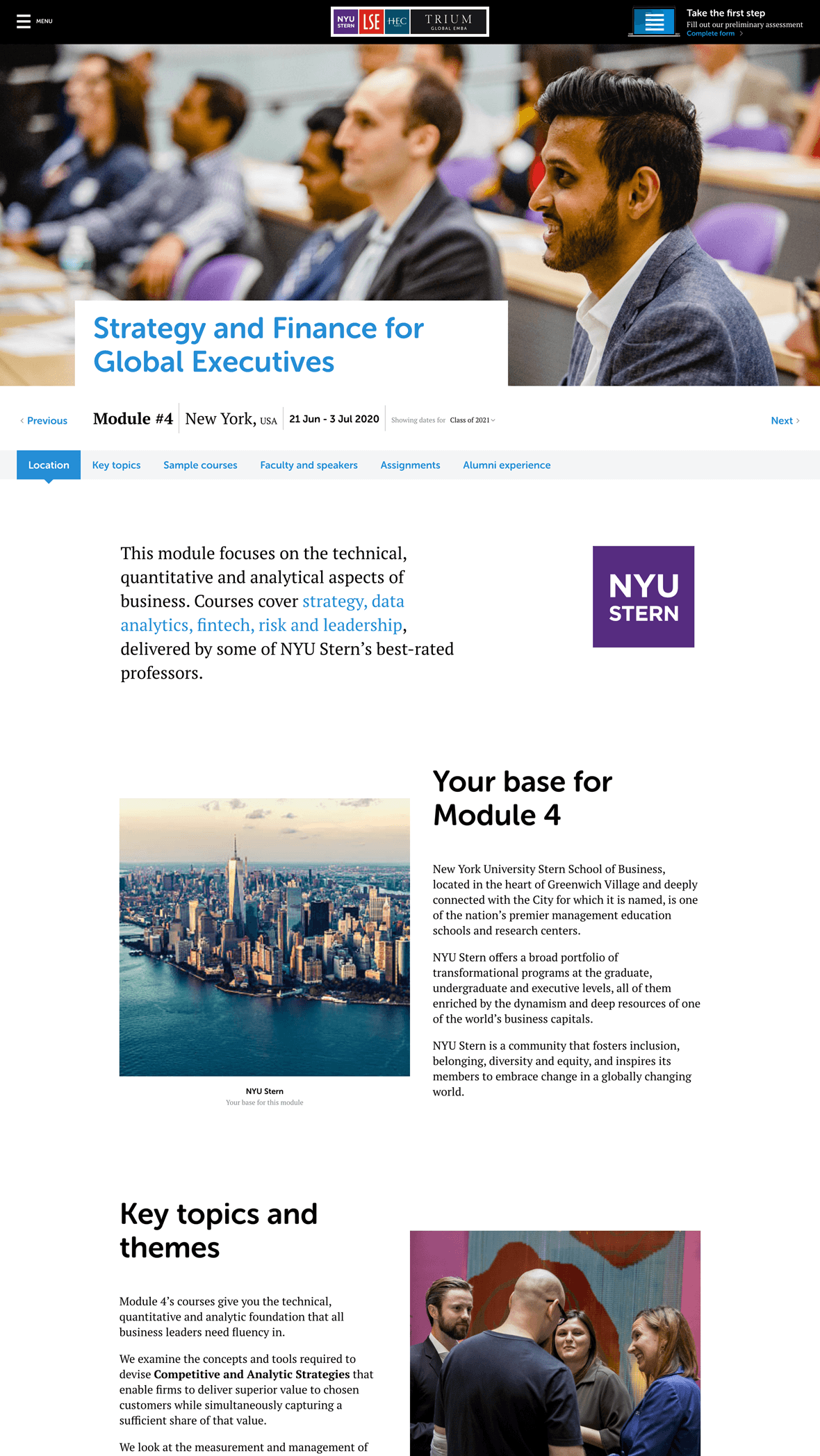
Research revealed that candidates wanted more much more detail about the content of the degree program, and needed to be able to envisage what it was like to be there, learning. It became clear that the more candidates understood the intellectual aspects of the curriculum itself, the more excitement was generated about being part of it.
So we significantly expanded this area of the site, with more content about the academic structure, and more imagery to give a real sense of the experience.
The overall design language was moved forward and updated, with a complete new set of design modules created, all built ground-up on a fresh codebase optimised for performance. The site is fully editable via WordPress.
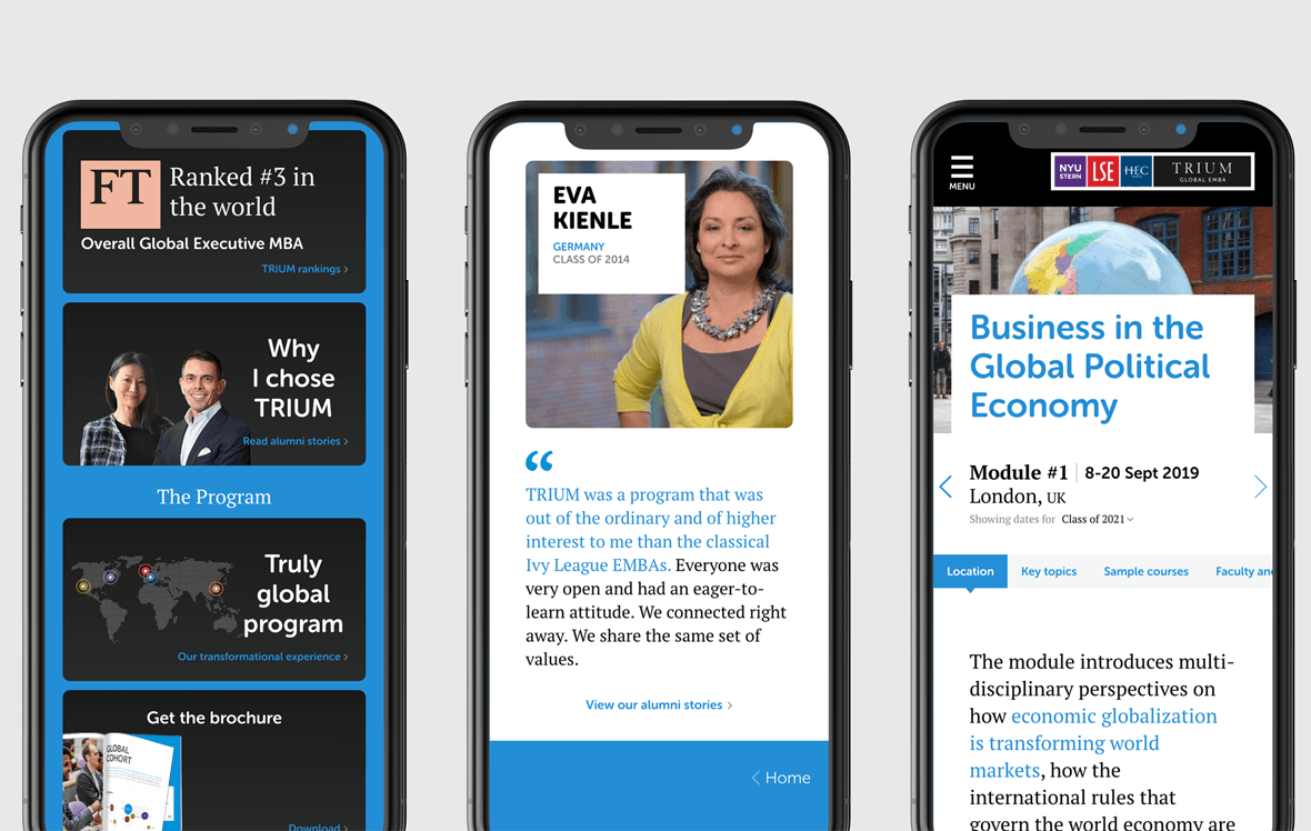
Majority mobile
With a majority of users accessing the site through their phones, the mobile experience is critical. It’s the first impression most have of TRIUM. A lot of care was taken in crafting the site mobile experience, with a specific mobile-first homepage design.
Applying the experience across touchpoints
The design language was extended across all collateral, bring everything up to date and providing a coherent user experience.